- 2 Posts
- 16 Comments
Joined 1Y ago
Cake day: Jun 22, 2023
You are not logged in. If you use a Fediverse account that is able to follow users, you can follow this user.

creator
to
but Aptos does look like an improvement
I think so too! Did you click through the Lorem Ipsum examples? Aptos is much easier on the eyes even in dense paragraphs.
I particularly like the serif added to the lowercase L
For the record, my calling those serifs has been a point of contention. To me Aptos feels like a semi-serif, not a sans-serif, although it’s officially one! However, it’s been suggested to me that I should do away with the serif terminology and call them simply stroke terminals!
Still mulling over this.
Hey Folks!
We've been playing and discussing Calibri, Aptos ( Bierstadt ), Grandview, Seaford, Tenorite and Skeena over on Tildes and I figured you folks would enjoy clicking around and seeing what the differences between them actually are.
I wrote the article, so let me know if there's something you'd like to see as well :D
Cheers !
creator
to
Thanks a bunch! Yeah, that sounds about right, but also Julia and since some folks on Mastodon [1] told me also 0xProto 😂! Welcome to the rabbit hole!
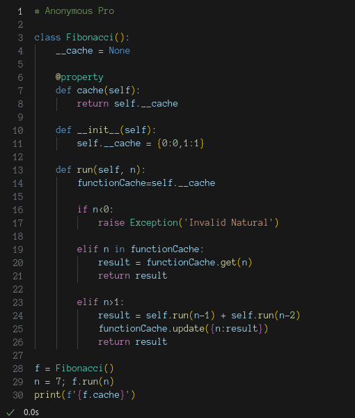
I agree wholeheartedly, it’s readable, but oh so ugly and brutalistic :P