The joke is that it’s hard to tell if this is a joke because the lines between good intentions, corporate jargon, and feasibility have been blurred beyond recognition both here and in the real world.
It’s also funny that after all these years, i18n is still a mess. Moreover, even if translations are standard in GUIs and documentation, for some reason, everyone is okay with defaulting to English for the oldest form of computer interaction.
Also, the joke is whatever you want it to be. Follow your dreams.
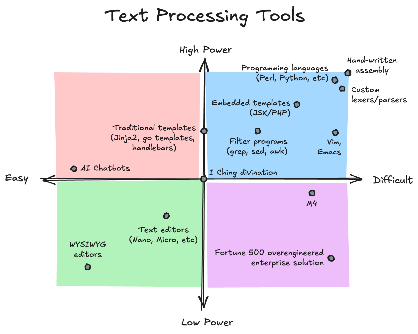
So I'm considering going deep into a data viz library, and I'm wondering what you people think. I'm not asking reddit because I know for a fact that all the hardcore people that know their stuff are on lemmy.
Here are my requirements:
- API must at least pretend to be reasonably designed.
- I know that viz libraries are complex. But I want something with carefully chosen primitives that scale reasonably well from "data goes in, chart goes out" to nit-picky adjustments.
- Defaults must not be ugly.
- Or at least there should be an easy way to bypass the default ugliness. I know that design is subjective, but how am I supposed to trust a library that operates on the visual space and yet decides that a bad default is ok?
- Here looks like ggplot has the upper hand. But there is a stylesheet that makes matplotlib look like ggplot, so maybe that's not a big problem.
- Must have a future.
- The github contribution chart on matplotlib just keep going up, it's insane. While ggplot not so much. But maybe it's hard to compete with the python hype machine, and that is that.
- Bonus points if interactive and renders to web too.
Non-requirements:
- Easy learning curve.
- I am a hardcore programm0r. I like it rough, as long as it's worth the effort.
- Heavy math stuff.
- I'm not designing rockets or wind turbines. I just want a way to visually represent data as lines, charts, pies, or maps, or maybe violins if I'm feeling fancy.
Thanks
Good point. I actually thing that having if x == true is bad practice anyway because it’s redundant, so showing a toggle in that context would have the benefit of highlighting that something’s wrong.
fwiw I opened an issue on the vs code repo. It already got a downvote and the issue was reassigned from one maintainer to another. Popcorn is tightly secured.


 English


Point taken, but Big Tech systematically does equally bad things while disguising them behind DevRel, so I think it’s justified to poke fun at that.